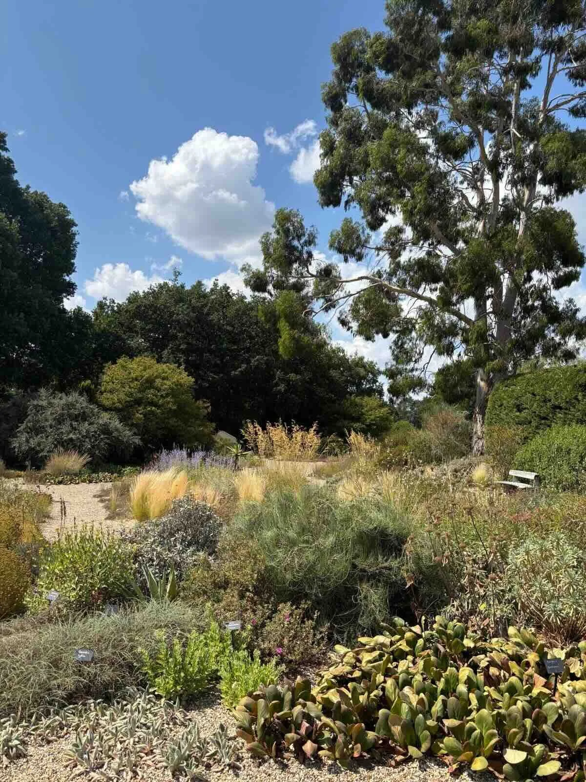
Today I visited Beth Chatto’s world-renowned garden in Essex.
This seven-and-a-half acre site was bought in the 1960s, and is very challenging as it is incredibly dry and infertile in places but also boggy in others - Beth Chatto’s mantra was “right plant, right place”, growing plants where they are happiest. The world renowned gravel garden - which isn’t watered - is especially inspiring for this summer’s climate.
I love visiting gardens or walking in the countryside because I find the plant colourings so inspiring. Many of our hand block printed linen collections are focused on a floral motif, which to my mind has to make natural sense. I don’t think we could ever have brown leaves, as although this is natural, to me it means the plant is dead.
So my camera roll is always packed with close-up pictures of petals, stamens, stems and leaves… today I even thought as the grass was so dry, it now resembled the colour of our background linen cloth!
Colour combinations which caught my eye today included:
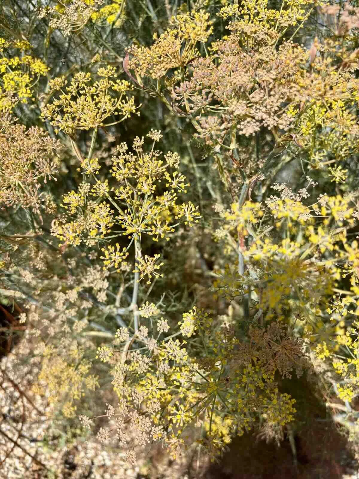
Burnt, dried yellows with a silvery grey stem, I think this was fennel.
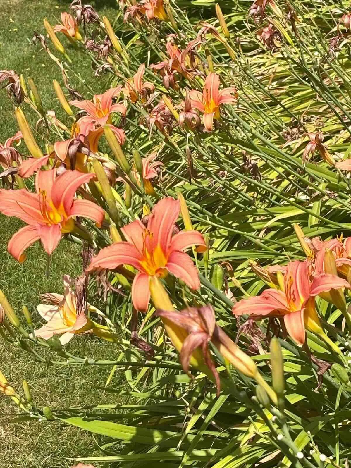
I always struggle with coral and peach tones but today found some lilies and succulents that rather showed me the way, perhaps?
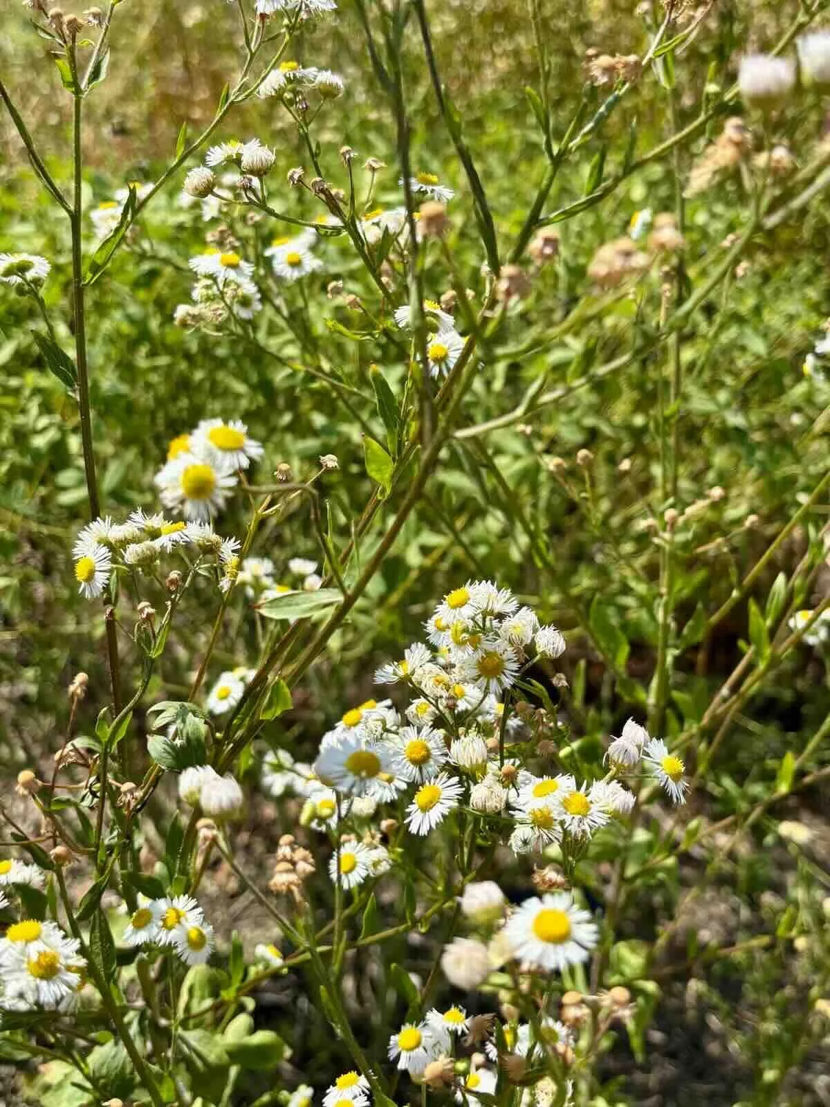
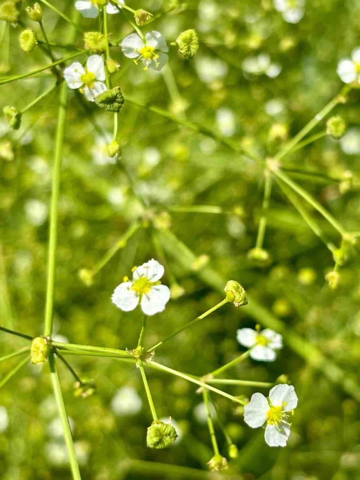
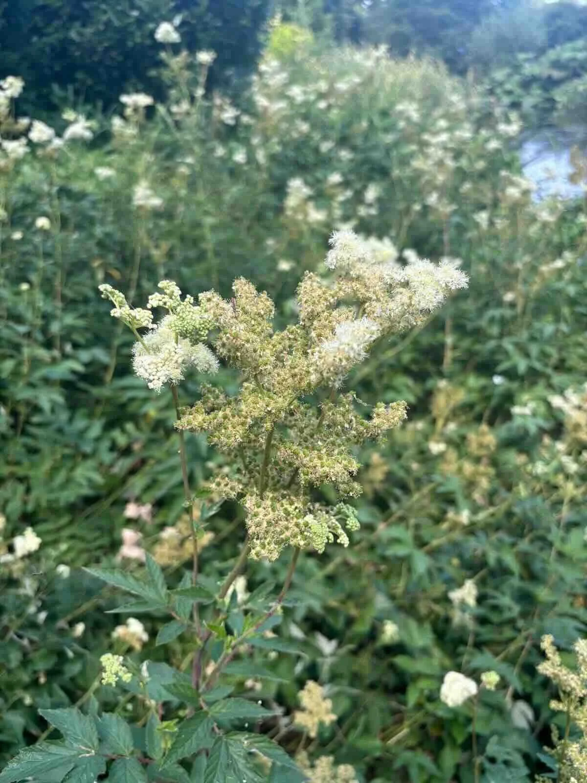
I’ve always wanted to print on coloured linen cloth, and today was inspired by the cream and white flowers which could work…
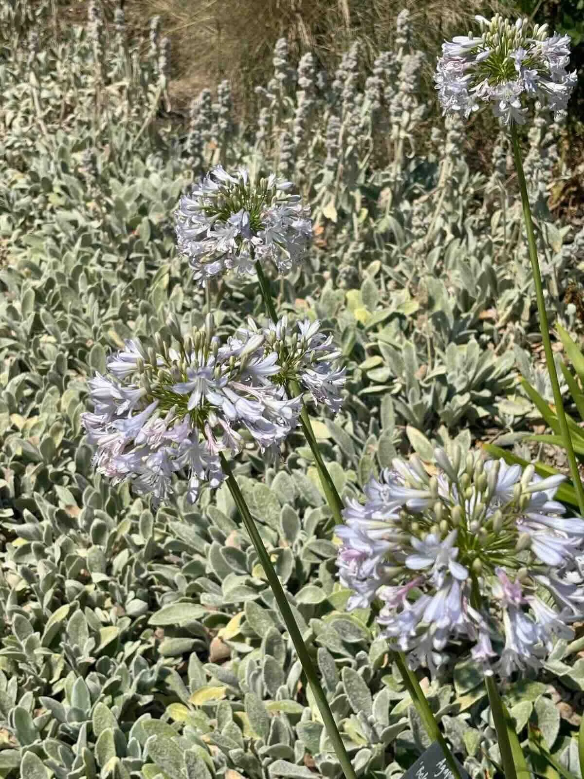
The pale washed out blue agapanthus sitting amongst a silvery ground cover was so light and delectable, with a very soft sage green.
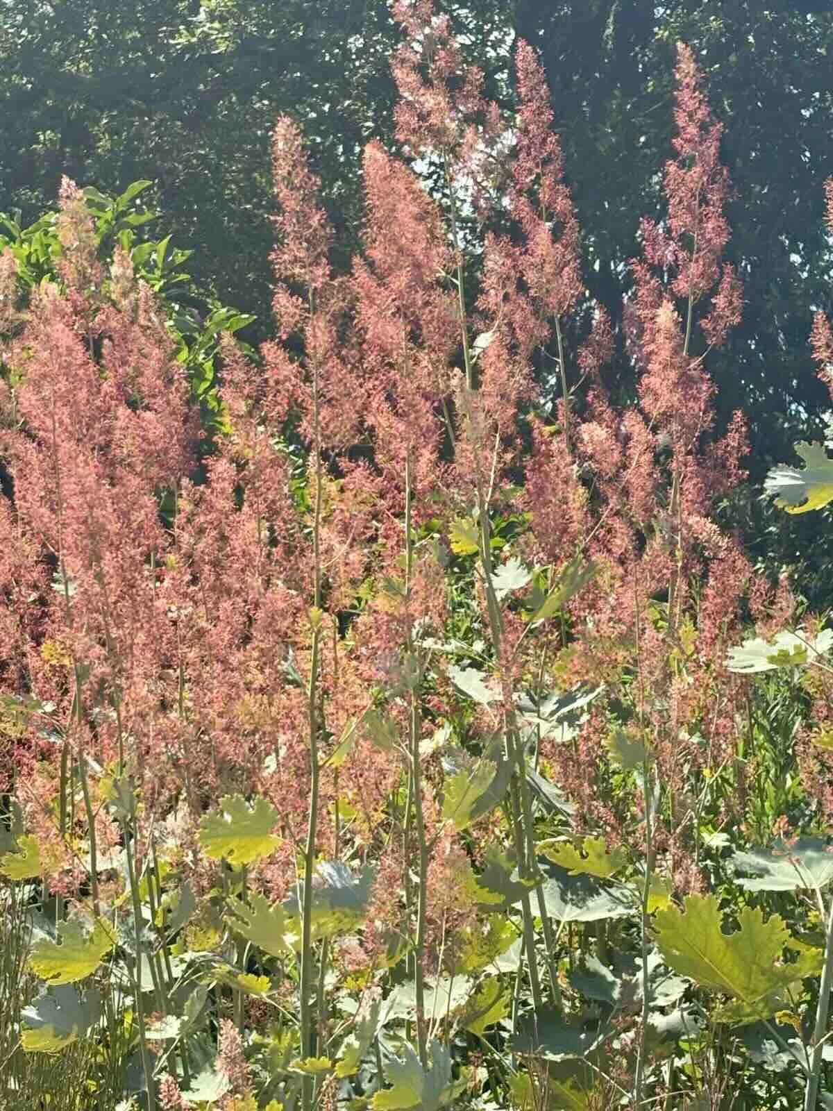
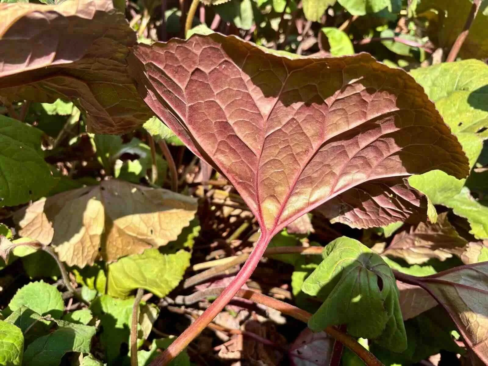
And also loved a rather luscious, boggy, unkempt green leaf with an aubergine veined underside and stained dark stems.
I might do one of these combinations as a seasonal colour story? This is high, dry, hot summer…
Jools